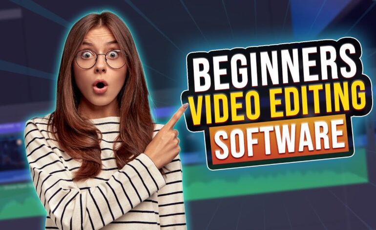
Introduction
Text and titles are essential elements in modern video production, providing context, emphasis, and information throughout your content. Whether creating YouTube videos, social media content, or professional presentations, understanding how to add and style text effectively separates amateur from professional-looking productions. This guide covers fundamental techniques for implementing text that enhances rather than distracts from your visual storytelling.
Understanding Different Text Types
Video text serves various purposes, each requiring different approaches. Lower thirds identify speakers and locations, appearing in the bottom screen area. Title cards introduce videos or segments, typically appearing fullscreen. Subtitles and captions transcribe dialogue for accessibility and silent viewing. Call-to-action text encourages specific viewer behaviors like subscribing or visiting websites. Understanding text types helps you choose appropriate styling and placement for each function.
Accessing Text Tools in Your Software
Every video editing program includes text capabilities, though interfaces vary. Look for “title,” “text,” or “graphics” tools in your software’s toolbar or menu. Most applications allow dragging text elements directly onto your timeline above video tracks. Text layers work like video clips, appearing for specific durations and accepting effects and animations. Familiarize yourself with your software’s specific text workflow before starting projects.
Choosing Appropriate Fonts
Font selection dramatically affects video professionalism and readability. Sans-serif fonts like Arial, Helvetica, and Roboto work well for video because they’re clean and easily readable at various sizes. Avoid overly decorative or script fonts unless they serve specific creative purposes. Use maximum two or three fonts per video to maintain consistency. Professional productions often use a single font family with different weights (light, regular, bold) for hierarchy.
Ensuring Text Readability
Readable text requires sufficient size, contrast, and positioning. Text should be readable on small mobile screens, not just desktop monitors. Use font sizes of at least 40-60 points for body text and 80-120 points for titles. Ensure high contrast between text and background – white text on dark backgrounds or dark text on light backgrounds works best. Add subtle shadows, outlines, or background boxes when placing text over complex or busy footage.
Positioning Text Effectively
Position text considering composition rules and safe zones. Keep important text within title-safe zones, typically 10% inside frame edges, preventing cropping on various display devices. Follow rule of thirds principles, positioning text along gridlines rather than perfectly centered. For lower thirds, place text in the bottom third while ensuring it doesn’t obstruct important visual information. Maintain consistent positioning across similar text elements throughout videos.
Creating Title Cards
Title cards introduce videos, chapters, or segments with bold, eye-catching designs. Effective title cards clearly communicate information without overwhelming viewers. Use larger text sizes, possibly fullscreen graphics or branded backgrounds. Keep title cards brief, typically 2-5 seconds duration. Ensure title card style matches your overall video aesthetic and branding. Consistent title card design across multiple videos creates professional, recognizable content.
Animating Text
Text animation adds polish and professionalism when used appropriately. Simple fade-ins and fade-outs work for most situations. Sliding text from screen edges creates dynamic introductions. Scale animations make text grow from small to full size. Most editing software includes animation presets for common text movements. Avoid excessive or distracting animations that pull attention from content. Subtle animations enhance professionalism; over-animation appears amateurish.
Adding Subtitles and Captions
Subtitles increase accessibility and viewer retention, particularly for social media where many watch without sound. Manual subtitle creation involves typing dialogue and timing it to match speech. Auto-transcription tools in modern editing software generate subtitles automatically, requiring editing for accuracy. Style subtitles for readability with clear fonts, appropriate sizing, and high contrast. Position subtitles consistently, typically in the lower screen area without blocking important visuals.
Text Effects and Styling
Text effects like shadows, outlines, glows, and background boxes improve readability and add visual interest. Drop shadows create depth separating text from backgrounds. Outlines define text edges, particularly useful when placing text over varied backgrounds. Background boxes provide consistent contrast regardless of underlying footage. Use effects subtly – excessive styling appears unprofessional. Most editing software includes effect presets that can be customized for your specific needs.
Creating Lower Thirds
Lower thirds are text overlays identifying speakers, locations, or providing context while occupying the lower portion of the screen. Professional lower thirds include both primary text (name) and secondary text (title or location). Design lower thirds with your brand colors and fonts for consistency. Animate lower thirds with smooth entrances and exits lasting 5-10 seconds. Position lower thirds consistently throughout videos, typically in the bottom left or right corner.
Text for Social Media Content
Social media videos require specific text considerations. Instagram and TikTok viewers often watch without sound, making text crucial for communication. Use larger, bolder text that’s readable on mobile devices. Keep text on screen longer for social media since viewers may need extra time to read while scrolling. Center-align text for vertical video formats. Add text highlighting key points or punchlines to increase engagement and shareability.
Maintaining Brand Consistency
Establish text styling guidelines for your videos including specific fonts, colors, sizes, and animation styles. Document these choices in a brand style guide for consistency across multiple videos. Create title and text templates in your editing software for quick application to new projects. Consistent text styling builds brand recognition and makes your content immediately identifiable. Professional channels maintain strict consistency across hundreds or thousands of videos.
Common Text Mistakes to Avoid
Avoid placing too much text on screen simultaneously, overwhelming viewers. Don’t use text durations that are too short for comfortable reading – minimum 3 seconds for single sentences. Never use low-contrast color combinations like yellow on white or dark blue on black. Avoid excessive capitalization, which appears amateurish and is harder to read. Don’t let text obscure important visual elements or subjects’ faces in your footage.
Testing Text Readability
Before finalizing projects, test text readability on multiple devices including smartphones, tablets, and televisions. What appears readable on your editing monitor may be illegible on smaller screens. Export test videos and review on actual devices your audience uses. Ask others to review your text for readability and timing. Testing prevents publishing videos with text issues that diminish professionalism and viewer experience.
Conclusion
Adding text and titles effectively enhances video communication, accessibility, and professionalism. Master font selection, ensure readability through proper sizing and contrast, position text thoughtfully, and apply subtle animations for polish. Whether creating lower thirds, title cards, or subtitles, consistent styling and careful attention to detail transform simple text into powerful communication tools. Practice these techniques regularly, and text implementation will become an intuitive part of your editing workflow.